Sunday, 15 August 2010

Johnson Banks logo mash-ups

London design studio Johnson Banks have put together a series of what they have called logo mash-ups. I think my favourite is the cross between Lacoste and Cost cutter, it almost seems to fit?
Below the first two here I have posted my attempt, sorry Massimo.


Re-blogged from Logo design love.

Wednesday, 28 July 2010

Helvetify for Safari 5

This is brilliant.

Change all the type within any webpage into, you guessed it, HELVETICA

Available to download for Safari 5 only at johanbrook.com

Friday, 16 July 2010

Brand New Conference


I'm envious of anyone going to this first ever Brand New Conference in November. Graphic design legends galore will be speaking there including two of my favourites, Paula Scher and Michael Bierut of Pentagram's New York office.

Saturday, 19 June 2010

A typography mantra


“The black space can never be beautiful until the white space is beautiful.”
-Unknown Russian designer

Wednesday, 9 June 2010

University of Hertfordshire Degree show


Read my review of the Graphic Design graduate show at the University of Hertfordshire over on fives & zeros.

Saturday, 8 May 2010

Google Chrome ad

Tuesday, 4 May 2010

Great xx video

Monday, 3 May 2010

Art print

I have a new art print available over at Society6
It is based on my 'Low ink' pillow designs, go have a look.

Friday, 23 April 2010

Thursday, 22 April 2010

Tuesday, 20 April 2010

New packaging for Mothercare.

Pentagram have been working with Mothercare on their new product packaging.


Full details on the Pentagram website.

Saturday, 17 April 2010

Howdi Heidi


Howdi Heidi is a new design blog (a collaboration by Tina Roth Eisenburg of swiss-miss.com and Switzerland Tourism) about anything and everything swiss.

Thursday, 8 April 2010

Print Shop from Urban Outfitters


Urban Outfitters along with Society 6, an international artist community of over 70 countries have created Print Shop. They offer any of the featured designs as art-prints, iPhone skins and laptop skins which are printed and shipped directly to you.

Thursday, 1 April 2010

Keep Calm...and Snap On?


Here are some screen prints for sale over at PhotoJojo. A new look at an old classic, perfect for the budding photographer in need of some uplifting spirit. Only $15 per print plus a tiny $2.50 for shipping.

Tuesday, 16 March 2010

If Fonts were Dogs

Saw this on "Just us.", justusdesigncollective.com


Friday, 12 March 2010

On Repeat

Some bits from http://cargocollective.com/onrepeat


Thursday, 11 March 2010

Illustration Aiiii

Here are some examples of work by an up and coming Illustrator (and student on my Graphic Design course) James Smart.

His style is quite radical in terms of how he portrays his subject matter. For example the work below is taken from a project involving the design of a cover for the book 'The End of The Line' by Charles Clover, which tackles the nitty gritty issues of commercial sea fishing in present day.
James' blatant and amazingly striking visuals for this book are enough to put anyone off supporting unsustainable fishing methods, which means it has done it's job perfectly.

More of his work can be seen on his blog.


Friday, 5 March 2010

Friday, 26 February 2010

Envelop

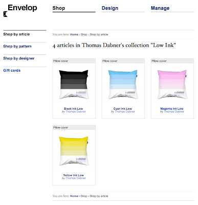
Envelop is a great site for young (and old) designers to have their work put into print and sold in the form of textile products.

Based in Belgium, but available to pretty much the whole world, they sell your textile designs (and manufacture everything) all you have to do is become an approved member and submit designs you believe to be exciting and saleable. (Note: they only accept designers who can prove they are constantly working, i.e with a website/blog showing your work).

Here is my latest collection of pillowcases entitled 'Low Ink', inspired by the frustration of your printer ink running low at critical moments of print. A design aimed at designers me thinks.


Thursday, 25 February 2010

What Type Are You?

Try this experiment on the Pentagram website to find out what typeface you more resemble.


My score told me I was most like Marina Script.

Friday, 19 February 2010

Wednesday, 17 February 2010

Safe sex advert

Just saw this on the Grafik blog

Tuesday, 16 February 2010

Haiti Information Graphic

Found this nice piece of info-graphics at www.informationisbeautiful.net/

Realtime downloads from the app store

Pretty cool data visulisation

Sunday, 14 February 2010

Cheese issue

Not particularly relevant, but I saw this and wanted to share it.
It's a drawing sent to subway.

Friday, 12 February 2010

Drawing

MILTON GLASER DRAWS & LECTURES from C. Coy on Vimeo.


Found this video a few days ago and found it quite interesting. Milton Glaser talks about how he believes drawing is the most important skill for a designer and how it should be practised from a young age.

Wednesday, 3 February 2010

New designer

After an invitation to contribute on the Jontom blog I was instantly excited about becoming a part of it. I hope to use my posts as a way to expand the content by showing my interests (mainly graphic design based) and help provide an even more fluent and inspiring blog for readers to indulge in.

My name is Tom Dabner and I'm currently in my second year studying Graphic Design at Sheffield Hallam University. I also have my own blog at www.fivesandzeros.blogspot.com which showcases my own work, but I will be using this space to create an insight to my interests and influences in design.

My main interest is corporate and brand identity which leads me to my first post:


A brand new book titled 'Logo Design Love' by Irish freelance designer David Airey. I have recently purchased this book in the hope of it enlightening me in my design skills and teaching me ways to utilise them properly. I must say so far it is fantastic! The case studies used are brilliant and the way in which he approaches the reader makes for an easy and insightful read.

"Iconic designs that stand apart from the crowd have just one feature to help them stand out. That's it. Just one. Not two, three, or four. One."

This quote taken from the book shows how direct and gripping his writing is. Above he was explaining the fundamentals of logo design, using the new 'French property Exhibition' logo (shown below) redesigned in 2008 by Roy Smith Design.


The book can be bought on Amazon.co.uk and also over at David's blog of the same title LogoDesignLove.


I hope you enjoyed my first post and look forward to many to come.


Saturday, 30 January 2010

Friday, 22 January 2010

Toilet humor


Followers

Contributors